Toggling with style: adding plotly-esque legend toggles to ggiraph

Coding
Published

January 1, 2026

NoteTL;DR
  • Add legend toggles to ggiraph while preserving ggplot styling.

  • Achieved via targeted CSS on the SVG: enable pointer events on legend keys; disable on non‑selected series.

  • Works with standard bars and stacked bars; likely generalises further.

  • Skip to the Final Implementation to see the code.

Why Interactivity Matters

Example of legend toggling with ggiraph

The end result - toggling series with ggiraph

Legend toggling is one of those small interactions that dramatically improves how people read charts but in R it often forces a trade‑off. You either sacrifice your carefully‑designed ggplot styling by switching to plotly (yes there’s ggplotly but there are frequently styling missed) or you accept essentially static charts and duplicate plots for each breakdown.

This post shows how to add plotly‑style legend toggles to ggiraph, keeping full control over ggplot aesthetics and without needing Shiny or a server.

Options for Adding Interactivity

Several options bring the style ggplot together with toggling:

  • Generate every version of the plot as images and then allow the user to select the one they want (e.g. through tabs). However, this can become unwieldy quickly and increase the size of files.

  • The plotly::ggplotly function allows many ggplot charts to be converted into plotly objects but in many cases styling gets lost in translation. We could work on improving the translation but a really deep understanding of ggplot and plotly would likely be needed.

  • shiny allows ggplot and ggiraph plots to respond to filters allowing a full range of interactivity. However, they require a server to host the app when we typically only need static webpages.

  • webR allows static webpages to run R code so users could regenerate with a different set of data showing. However, this can be slow and adds significant complexity for end users who typically aren’t technical.

  • ggiraph adds elements of interactivity to ggplot but these are limited to things like tooltips and zooming while features to toggle on or off series are unsupported. Packages like crosstalk require dataframes so to extend ggiraph. However, ggiraph objects are htmlwidgets which means they should respond to css and the package already has functions that detect the selection (or hover over) of a series to change it’s styling (e.g. opts_selection which is demonstrated below from a ggiraph vignette).

Show the code
library(ggplot2)
library(ggiraph)

dataset <- mtcars
dataset$carname = row.names(mtcars)

gg <- ggplot(
  data = dataset,
  mapping = aes(x = wt, y = qsec, color = disp,
                tooltip = carname, data_id = carname) ) +
  geom_point_interactive() + theme_minimal()

x <- girafe(ggobj = gg)
girafe_options(x, opts_selection(type = "multiple", only_shiny = FALSE,
                                 css = "fill:red;stroke:gray;r:5pt;"))

Of these ggiraph was likely to provide the simplest path.

Challenges and Solutions

The first step was to show the data series behind each other (relatively standard ggplot fare) and then use the data_id feature of ggiraph to link the selection of series to changing the colour.

Show the code
library(dplyr)
library(tidyr)
library(graPHIC)

iris_sum <- iris |>
  group_by(Species) |>
  summarise(across(where(is.numeric), mean)) |>
  ungroup() |>
  pivot_longer(cols = -Species)

default_series <- iris_sum$Species[1]

p <- iris_sum %>% ggplot(aes(name, value, fill = Species,
                             tooltip = Species, data_id = Species)) +
  geom_bar_interactive(aes(`data-id` = Species), stat = "identity",
                       position = "identity", extra_interactive_params = "data-id") +
  scale_fill_manual_interactive(extra_interactive_params = "data-id",
                                values = c("transparent", "transparent", "transparent"),
                                `data-id` = unique(iris_sum$Species),
                                data_id = function(breaks) as.character(breaks)) +
  theme_phic()

girafe(ggobj = p, options = list(
  opts_selection(girafe_css(paste0("fill:", phic_palettes$blues[2], ";")),
                 type = "single", selected = default_series, only_shiny = FALSE)))

You’ll notice however that any mouse movement leads to series flashing on and off and the tooltips for the wrong series are shown if one hovers over an invisible but higher‑z series. Allowing the interactivity of the legend without issues arising when the user hovered or clicked on the plot was relatively straightforward.

Show the code
girafe(ggobj = p, options = list(
      opts_selection(girafe_css(paste0("fill:", phic_palettes$blues[2], ";")),
                     type = "single", selected = default_series, only_shiny = FALSE),
      opts_hover(girafe_css("fill-opacity:1;")), # stop series disappear on hover
      opts_hover_key(girafe_css(paste0("fill:", phic_palettes$blues[1]))))) # make key not orange on hover

However, ensuring the right tooltip showed was more complex. If you mouse over the bars above you’ll see the incorrect species is often displayed. Disabling all pointer events (aka mouse movements and clicks) from the inverse of the selection meant that the right tooltip showed but other series couldn’t be selected and there was no way to turn on pointer events for the legend but not the plot due to the links between the data series and the legend.

Show the code
girafe(ggobj = p, options = list(
      opts_selection(girafe_css(paste0("fill:", phic_palettes$blues[2], ";")),
                     type = "single", selected = default_series, only_shiny = FALSE),
      opts_hover(girafe_css("fill-opacity:1;")), # stop series disappear on hover
      opts_hover_key(girafe_css(paste0("fill:", phic_palettes$blues[1]))), # make key not orange on hover
      opts_selection_inv(girafe_css("pointer-events: none !important")))) # ensure right tooltip shows

At a high level, the fix is simple: disable pointer events for non‑selected series everywhere, then selectively re‑enable them for legend keys only. The challenge is in finding what elements to enable and disable.

Much like ggplot, ggiraph objects are divided into sections. One contains the actual plotting area where the data is shown while another contains things like the axis labels, title, and legend. If we can identify the legend elements we can apply different rules to these items than the rest of the plot:

  • Each section of the plot is its own <g> object, each with a clip-path. While the exact clip-path IDs are auto‑generated, ggiraph consistently assigns the legend group to the final <g> element, which (in current versions) consistently ends in “c1)”. We’ve found this reliable in practice, but it’s worth re‑checking if upgrading ggiraph or using different plot types.

  • Within the legend, each key is <rect> object with a class starting with select_.

Between the clip-path and rect we can create a quite precisely targeted <style> rule to enable pointer events for these specific objects regardless of their selection state, while disabling pointer events for non-selected series on the rest of the ggiraph object. The scoping also prevents it affecting other elements on the page.

It’s admittedly not great form to pepper css with ! important but if it works it works (suggestions for cleaner solutions are welcome).

Final Implementation

The below strips out the internal styling dependencies for easy reuse.

Show the code
library(htmlwidgets)
library(ggiraph)
library(dplyr)
library(tidyr)
library(ggplot2)

iris_sum <- iris |>
  group_by(Species) |>
  summarise(across(where(is.numeric), mean)) |>
  ungroup() |>
  pivot_longer(cols = -Species)

default_series <- iris_sum$Species[1]

p <- iris_sum %>% ggplot(aes(name, value, fill = Species,
                             tooltip = Species, data_id = Species)) +
  geom_bar_interactive(aes(`data-id` = Species), stat = "identity",
                       position = "identity", extra_interactive_params = "data-id") +
  scale_fill_manual_interactive(extra_interactive_params = "data-id",
                                values = c("transparent", "transparent", "transparent"),
                                `data-id` = unique(iris_sum$Species),
                                data_id = function(breaks) as.character(breaks)) +
  theme_minimal()

p2 <- girafe(ggobj = p, options = list(
      opts_selection(girafe_css(paste0("fill:","#3d5073", ";")),
                     type = "single", selected = default_series, only_shiny = FALSE),
      opts_hover(girafe_css("fill-opacity:1;")), # stop series disappear on hover
      opts_hover_key(girafe_css(paste0("fill:", "#b8d8e2"))), # make key not orange on hover
      opts_selection_inv(girafe_css("pointer-events: none !important")))) # ensure right tooltip shows

# in ggiraph objects, the g element with a clip-path ending in 'c1)' is the legend - find it and enable pointer events
prependContent(p2, htmltools::tags$style(".ggiraph-svg-rootg g[clip-path$='c1)'] rect[class^='select_'] { pointer-events: all !important;}"))

Working with stacked bars

A final addition was that we wanted to be able to have stacked bar plot. These are useful for displaying results for multi-choice surveys for instance. For this toggling fill colours alone isn’t sufficient. Instead, we control alpha so that non‑selected questions fade out while preserving the stack structure.

Show the code
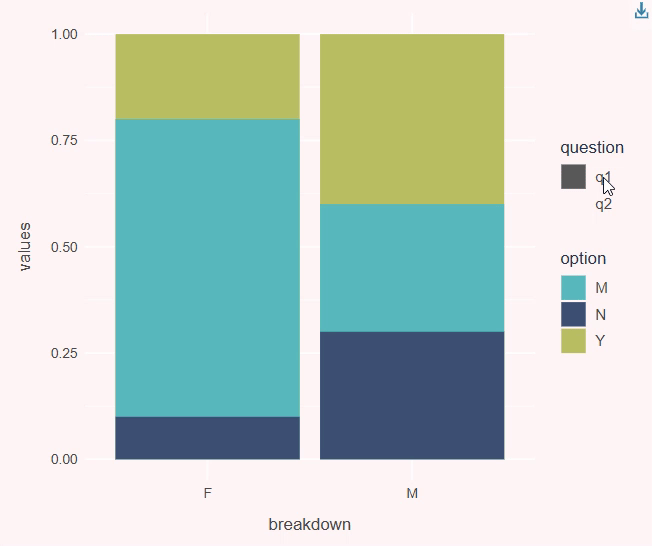
question_data <- data.frame(question = c("q1", "q1", "q1", "q1", "q1", "q1",
                                         "q2", "q2", "q2", "q2", "q2", "q2"),
                            option =   c("Y", "M", "N", "Y", "M", "N",
                                         "Y", "M", "N", "Y", "M", "N"),
                            values =   c(1, 0.6, 0.3, 1, 0.8, 0.1,
                                         1, 0.7, 0.2, 1, 0.5, 0.4),
                            breakdown = c("M", "M", "M", "F", "F", "F",
                                          "M", "M", "M", "F", "F", "F"))
p <- question_data %>%
  ggplot(aes(x = breakdown, y = values, fill = option, tooltip = paste0(question, ":", option),
             alpha = question, data_id = question)) +
  geom_col_interactive(aes(`data-id` = question), position = "identity",
                       extra_interactive_params = "data-id") +
  scale_alpha_manual_interactive(extra_interactive_params = "data-id",
                                values = c(0, 0),
                                `data-id` = unique(question_data$question),
                                data_id = function(breaks) as.character(breaks)) +
  scale_fill_phic() +
  theme_phic()

default_series <- "q1"

p2 <- girafe(ggobj = p, options = list(
  opts_selection(girafe_css("fill-opacity:1;"), type = "single",
                 selected = default_series, only_shiny = FALSE),
  opts_hover(girafe_css("fill-opacity:1;")), # stop series disappear on hover
  opts_selection_key(girafe_css(paste0("fill:", "#3d5073", "!important ;"))),
  opts_hover_key(girafe_css(paste0("fill:", "#b8d8e2",
                                   "; fill-opacity:1 !important"))), # make key not orange on hover
  opts_selection_inv(girafe_css("pointer-events: none !important; fill-opacity:0 !important;")))) # ensure right tooltip shows

# in ggiraph objects, the g element with a clip-path ending in 'c1)' is the legend - find it and enable pointer events
prependContent(p2, htmltools::tags$style(".ggiraph-svg-rootg g[clip-path$='c1)'] rect[class^='select_'] { pointer-events: all !important;}"))

How it works

ggiraph outputs an SVG with grouped sections (<g> elements). The plot area and legend are separate groups. To achieve the result we:

  • Disable pointer events on non‑selected series across the whole widget (opts_selection_inv()), so tooltips align with the selected series.

  • Then re‑enable pointer events in the legend by targeting the legend group via CSS (g[clip-path$='c1)']) and legend keys (rect[class^='select_']). This ensures clicks in the legend still work, while the plot area ignores the non‑selected series.

Closing remarks

We wrapped this approach into a single helper in our dataviz package, so adding legend toggles with consistent styling is now a simple argument to our plotting functions. It won’t replace Shiny for complex interactivity, but most of our work uses static pages and this greatly extends how far we can get without adding the overhead of a server.

Back to top