Writing up your findings
Talk based methods
Writing up is not simply a matter of reporting what participants said. It is the stage at which your analysis becomes a coherent, evidence-based account that can inform decisions, shape services, or contribute to wider understanding. Done well, it communicates your findings clearly and honestly, does justice to the people who gave their time to participate, and is useful to the people who will read it.
Structuring your findings
There is no single correct way to structure qualitative findings, but the approach should always be driven by your research questions and the logic of your analysis, not by the order of your topic guides, or the order in which interviews were conducted.
A common and effective approach is to organise findings around analytical themes or categories, with each theme forming its own section or subsection. Within each theme you can build an argument by drawing on evidence from across your dataset to make a point or illustrate a pattern.
Each section should be less of a summary of what was said and more as an answer to a question - what does this theme tell us, and why does it matter?
Some practical principles for structuring your findings:
Lead with analysis, not description: Each section should open with an analytical statement (e.g., stating what the theme means or what it shows) before moving into supporting evidence.
Start broad and move to specifics: Describe the overall finding first, then use quotes and examples to illustrate and evidence it.
Acknowledge variation and complexity: Explain if and how views differed between participants as this will strengthen your analysis.
Maintain a clear link to your research or evaluation question: Readers should be able to see how each finding relates back to your initial research or evaluation questions.
Using quotes and extracts
Verbatim quotes are a useful way of supporting your claims and bringing your findings to life. It is essential that quotes are used carefully (both analytically and ethically) and are not over-used.
Most importantly, quotes should illustrate and evidence your analytical points, not replace them entirely. A quote on its own is not a finding or a description of a finding. Quotes need to be introduced and followed by clear and thoughtful interpretation of what it might indicate, or why it is important.
Introduce - make an analytical point
Quote - share a quote(s) as evidence
Interpret - draw out what the quote demonstrates
Participants frequently described feeling that services were designed around organisational convenience rather than their own lives. One participant captured this plainly:
“The clinic is only open during the day, so I’d need to take time off work, which isn’t possible for me. It just never feels very flexible.” [Parent D]
This sense of services operating on terms set by the system rather than by users was a recurring point raised across interviews and was often cited as a reason for delayed or avoided contact.
In this example, the analytical framing before and after the quote it is what gives the quote meaning, providing a clear example for readers.
A few key practical tips:
Clean your quotes but do not over-edit. It is best practice to remove filler words (e.g., “um” or “err”) but avoid rephrasing in ways that alter the voice or meaning of what is being said.
Use ellipses to indicate omissions. If you are using one part of a longer extract, use “…” to show where you have removed any text.
Use square brackets for clarifications. If a quote requires a small addition to make sense out of context, use square brackets to show that the addition has been made by you, not the participant (e.g., “They told us [the school] had run out of funding.”)
Aim to draw on a range of voices across your dataset. A findings section that relies heavily on two or three people can give a misleading impression of how widely a view was held.
Participants should always be anonymised. This requires more than just replacing names - job titles, descriptions of specific events, or combinations of demographic detail can all be identifying, especially in organisations or professional networks where readers may know who took part.
Visualising qualitative findings
Visual representations can help your audience understand the overall structure of your analysis, the relationships between themes, and engage with findings that might otherwise feel abstract. The key is that any visual should add genuine clarity, not just aesthetic value.
There are various ways of visualising your qualitative findings, and how you choose to present your data will depend on your methods and your findings.
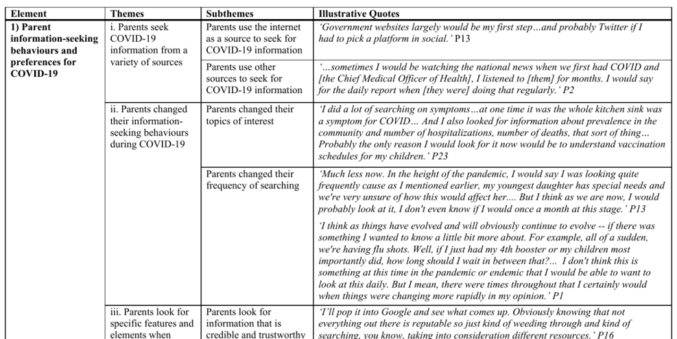
Summary tables
A table summarising themes, sub-themes, and brief descriptions can help readers navigate findings sections and provides a useful overview of your key findings, especially in longer reports.
Illustrative frameworks and matrices
If you have used a structured analytical approach such as framework analysis, the matrix itself (e.g., from Excel) or a simplified version of it, can sometimes be included as an appendix giving readers insight into the analytical process as well as the findings.
Thematic maps
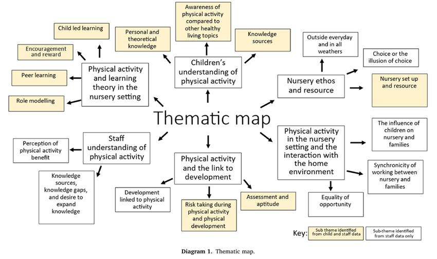
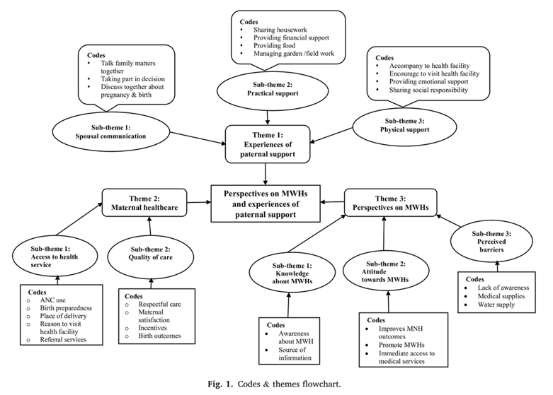
A thematic map is a diagram that represents the themes identified in your analysis and the relationships between them. They are particularly useful for showing how themes connect, overlap, or sit in relation to each other, and can work well as an orientation tool at the start of a findings section before the themes are explored in depth.
Thematic maps do not need to be complex. A simple diagram showing your main themes and any sub-themes, with brief labels and connecting lines or arrows where relevant, can be really effective.
Tools such as PowerPoint (e.g., using shapes or SmartArt) or Canva, Microsoft Whiteboard, and Miro can be used to create them without any specialist design skills.